


Refund: Creating a Friendlier Approach
- Jacqueline Elizabeth

- Jan 18, 2020
- 2 min read
Updated: Jan 19, 2020
I took a friendlier approach to eliminate users' fears and doubts when they need to refund their flight tickets.
About the Project
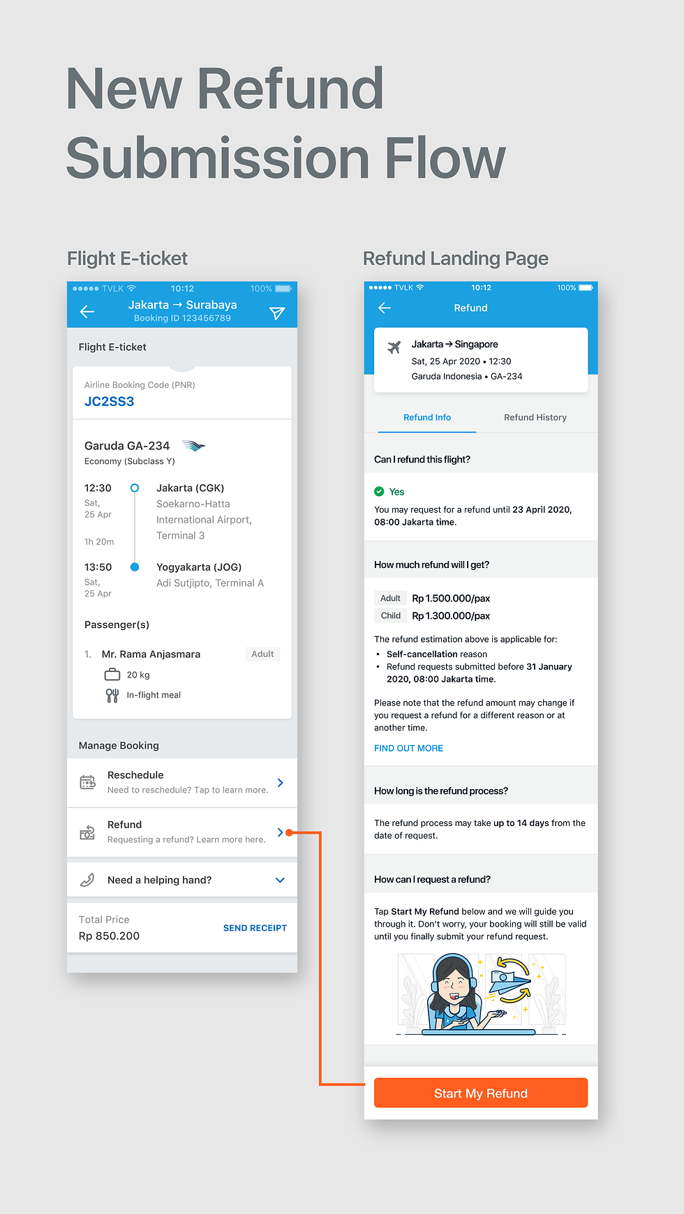
After booking a flight ticket, sometimes users need to refund them–maybe their plans changed, or they got sick and cannot make the trip. That's why Traveloka has a refund feature, which allows users to request a refund directly via our app–therefore eliminating the hassle of dealing with airline's customer service.
However, we found that users experience doubts while thinking of requesting a refund via our app. They got questions, such as:
How much of my money will I get back?
How long until I can get my money back?
If I request a refund now, will my tickets got immediately canceled?
They needed this information to help them decide whether they really want to cancel their tickets or not. But since they couldn't find the answers easily enough, they became scared even just to tap the REQUEST REFUND button, as they fear their booking would get automatically canceled before they are ready to decide.

The Solution
Set users' expectations that when they enter the refund flow, their booking will not be canceled until the refund request is submitted.
Provide more information to help users decide whether they want to go through with canceling their tickets or not.
Use a "friendly" tone to the whole interaction so users wouldn't feel intimidated.
How I Helped
Role: UX Copy Editor
Set a friendlier and conversational approach to the copy to help ease users' fears and doubts
Collaborated with the Product Manager and Interaction Designer to determine the page's information structure and key messages
Edited and fine-tuned the copy created by Copywriters to ensure clarity and to achieve the intended friendlier tone
Here are some key copy differences to make the interface feels friendlier to the user.


Comentários